Systems | Development | Analytics | API | Testing
%term
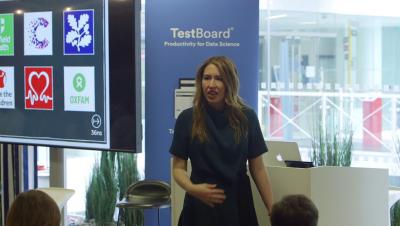
Data Festival London - From "Data reporting" to "Data storytelling"
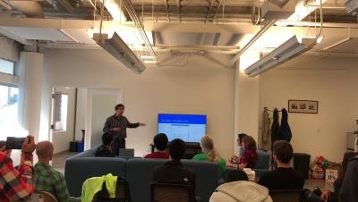
Jeremy Glassenberg gives a talk on API best practices at a Moesif meetup.
Agile & DevOps are Not Just a Fad: Master Test Automation with Reggie Moore
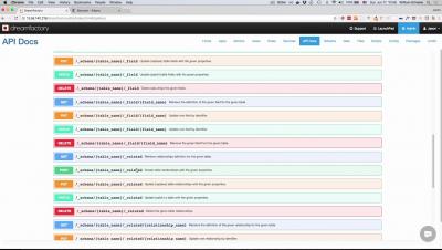
Generating REST APIs for MS SQL Server
StdLib CEO gives demo of creating a serverless API in 30 seconds at a Moesif meetup.
Visualizing Distributions
In my last blog post, I finished up how to create maps with your data using either point, area or flow representation. Today we’re starting with a new topic focusing in on how to visualize the distribution of data. You may remember from my “Mapping data to visualization usage” post that one way to break down the usage of chart is to divide them into these four groups: Comparison, Composition, Distribution and Relationship.
Bugfender Outage - What Happened and What We've Done
I’d like to offer a heartfelt apology to all of our users who have experienced any downtime and issues with Bugfender recently. We’re really sorry these have occured and for all of the inconveniences they may have caused you. We understand that many people rely on Bugfender to help them in their daily duties and that our service has let you down.


