Systems | Development | Analytics | API | Testing
BI
Maps, Violin Plots and Waterfalls
A good data visual can provide a very fast construct of a situation or trend – useful when you have a large, complex dataset or information that isn’t joined or connected. There are many types of data visualizations available. Which is the right one for your use case?
Achieve Insightful Operational Reporting for Oracle ERPs
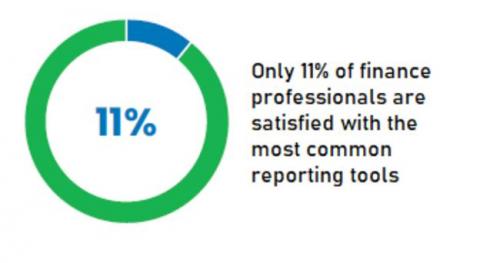
Your business needs actionable insights from your Oracle ERP data to respond to volatile market conditions and outpace your competition. But generating custom reports requires deep technical knowledge and the process is often managed by IT. The process can often take weeks, if not months, and, in many cases, the report or dashboard is limited to a single use case and applicable only to a single business unit or user – often only the requester.
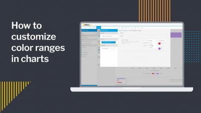
How to customize color ranges in charts
Streamlit Integration With Snowflake For Python Users
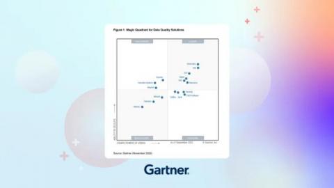
Our reflections on the 2022 Gartner Magic Quadrant for Data Quality Solutions
In its 2022 Magic Quadrant™ for Data Quality Solutions report, Gartner® emphasizes the “importance of having a critical approach toward managing the health and fitness of data.” We agree that “poor data quality completely destroys business value.” Organizations simply cannot afford for data quality to be an afterthought. And if you’re currently in the process of evaluating data solutions for your organization, this report can help.
Streamlit Demo & High Level Overview
Ozone Write Pipeline V2 with Ratis Streaming
Cloudera has been working on Apache Ozone, an open-source project to develop a highly scalable, highly available, strongly consistent distributed object store. Ozone is able to scale to billions of objects and hundreds petabytes of data. It enables cloud-native applications to store and process mass amounts of data in a hybrid multi-cloud environment and on premises.
What is a data catalog?
Time to Modernize Your Data Architecture?
Are legacy systems and information silos helping or hindering you from getting the most from your data? A TDWI Research report suggests it may be time to rethink your data architecture.


