Systems | Development | Analytics | API | Testing
The Power of Data and Analytics To Help Opening the Workplace
The world has gone remote. For those that can, working from home has become the new normal thanks to Covid-19. The gradual shift underway over the past number of years has accelerated, and most organizations have adapted. This mass pivot has been enabled largely by technology, specifically the move to SaaS and cloud, which allow employees to working productively from almost anywhere.
Qlik - 2020 Gartner Bake-Off - Full Demonstration
Using Augmented Intelligence To Drive Recovery and Growth Through COVID and Beyond
There seems to be universal acceptance that effective use of data can help maximize bottom line value. However, many businesses still aren’t successfully leveraging data to its full extent due to people, processes and technology roadblocks. Thankfully, there is a unifying approach to unlocking the immense opportunity for enterprises to more effectively leverage data to create new products, services and business models.
Qlik + FORTUNE - How We built The FORTUNE and Global 500 Microsites
The FORTUNE 500 list by FORTUNE is one of those venerable institutions of the business world. Since 1955, FORTUNE has been portraying the shape of the U.S. economy through its annual top 500 companies.
Strength in Numbers: Why Crowdsourcing Works!
The heat of summer and the smell of fresh-cut grass triggers many memories. I feel a sense of yearning from those memories, particularly as I know, during normal times, the college football season has begun. It’s been many years – too many to mention here – since I last played. The sense of anticipation persists, as it is this time of year the team would gather for camp.
Qlik Data Analytics September 2020 - Feature Demonstration
The Evolution of Insight Advisor - Qlik Sense September 2020
With the third generation of BI upon us, analytics solutions are leveraging AI to generate insights, automate tasks, and support new types of interactions. Qlik is consistently recognized as a leader in augmented analytics, and with the September 2020 release, we’ve set the bar even higher.
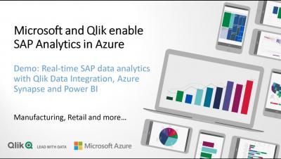
Microsoft SAP Qlik Data Integration Full Demo
The Current State of Data and Analytics and COVID
The pandemic has created monumental shifts in daily life, making all of us re-evaluate almost every aspect of our work and home lives.


