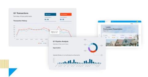
What is Yellowfin Present? How to Create Professional Presentations
Effectively communicating insights derived from data is a cornerstone of successful decision-making in today's landscape. Yet, many businesses struggle to translate complex analytics into compelling narratives that resonate with diverse audiences. The ability to create engaging and informative presentations directly from data is a critical requirement for modern embedded analytics platforms.


