Systems | Development | Analytics | API | Testing

Yellowfin

Editing and saving a dashboard

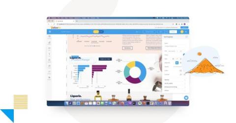
In this video you will learn how to edit one of your existing Yellowfin dashboards — such as adding a new report to a dashboard and then save those edits by publishing the dashboard. You will also learn how to edit/change the title of the dashboard, select/change the folders where the dashboard will be saved, and how to add tags to your dashboard. You will also learn how to edit/change the Dashboard Access to either Public or Private.

The Ultimate Guide to Choosing the Best JavaScript Charting Library

Charting libraries are in great demand, and their creation and use are becoming increasingly popular in languages such as JavaScript. As evidence, several JavaScript charting libraries are available, both commercial and open-source, with a wide range of functionalities to meet the demands of users. But how can a developer make an informed decision and choose the best JavaScript charting library? It's a difficult question, but we're here to assist!

How to add multiple charts to a report

In this video you will learn how to add multiple charts, or visualizations, to a single data table as you build a report. You'll learn about using the Auto Chart feature, as well as manually selecting your own chart types. In addition to adding charts, you will learn how to add text, graphics, and images to your report. Once you are finished adding charts and other visual elements, you will learn how to properly save your multi-chart report.

Yellowfin 9.8 Release Highlights

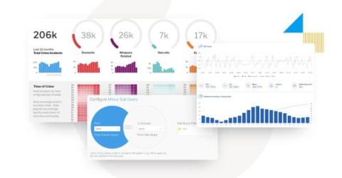
Introduced in 9.7 as the simplest way to ask questions of your data, Yellowfin 9.8 delivers exciting updates to Guided NLQ, and additional improvements to our report builder. The latest release makes Guided NLQ even more powerful and simpler to use, with new question types (Cross-tab), more intuitive questions with field synonyms and default date periods, and protection against long-running queries - in addition to faster report building.

The Fascinating History of Data Visualization

Data visualization is an elementary component of human learning and understanding. It's also a significant capability of business intelligence (BI) and analytics solutions today. So, how did data visualization first come to be? The humble origins and gradual evolution of data visualization has led to an interesting timeline.

The Critical Elements of Effective BI Dashboards

A business intelligence (BI) dashboard is an essential tool for managing and monitoring your business data. Well-designed BI dashboards can help you quickly and easily understand your company’s performance, identify trends, and make informed decisions. In this article, we will discuss seven key elements of an effective business intelligence dashboard. By understanding these elements, you can create a powerful tool that helps you manage your business data effectively.

7 Key Benefits of Data Visualization Tools

Data visualization is one of the most important capabilities of any business intelligence (BI) and analytics solution. It helps people translate complex data into a visual context, like a chart or a graph, identify trends numbers alone can't easily reveal, and discover hidden patterns in your dashboard. Data visualization also provides a wealth of additional benefits, such as enabling easier understanding of the correlation between operations and results.