Systems | Development | Analytics | API | Testing

Databox

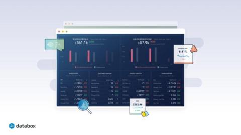
Our architectural approach to support multi-product strategy

Databox is mostly known for its business analytics and visualization capabilities. As a single-product company for the majority of its existence, it was developed in a way that catered to just one product. As the company began its path as a startup, it was convenient to keep the architecture simple and flexible to quickly adapt to change and align direction if needed to ensure business success.

The State of Agency-Client Collaboration in 2024

Most agencies struggle with the same challenge: proving the value of their work to their clients and showcasing performance in an understandable way while ensuring internal processes are streamlined and optimized. You usually have no time to build complex reports across multiple platforms for every client. The data you need is scattered across different sources, and most of your processes require manual data collection and calculations.

Fostering Collaboration and Innovation through Databox Engineering Guilds

Helping companies leverage their data to make better decisions and improve their performance is something we strive for at Databox. Until recently, this type of analysis has only been reserved for larger enterprises with dedicated teams and budgets for complex tools. Fortunately, recent innovations are reshaping this landscape.

18 SaaS Metrics and KPIs Every Company Should Track

Growing any business is difficult, but scaling a software as a service (SaaS) company is on a whole other level. Most SaaS companies struggle to achieve predictable revenue growth, while even public SaaS companies struggle to achieve profitability. To make a SaaS company successful, you can’t just change your software delivery model to the web and expect it all to work. You have to make thoughtful, data-driven decisions when it comes to your marketing, sales, and customer success operations.

How to Write an Informal Business Report

The main problem with writing only formal reports in your company is that you won’t be able to quickly and efficiently communicate important urgent messages and the latest updates to your management and team leaders. You always have strict rules and formats that you have to follow, which will disable you from conveying crucial information in a timely manner. The biggest issue is that your management needs that information in order to make the day-to-day decisions and create efficient strategies.

How to Write Data Analysis Reports in 9 Easy Steps

Imagine a bunch of bricks. They don’t have a purpose until you put them together into a house, do they? In business intelligence, data is your building material, and a quality data analysis report is what you want to see as the result. But if you’ve ever tried to use the collected data and assemble it into an insightful report, you know it’s not an easy job to do.

How to Create a Bar Graph in Google Sheets [3 Easy Steps]

Look, while they’re certainly not the easiest way to consume information, most companies are still using spreadsheets in order to pull a lot of different data into one place. That’s the strength of Spreadsheets – collating a lot of information in one place. And while there’s a lot of functionality within a tool like Google Sheets to categorize and manipulate the data, it’s not the best tool to present performance data to others.

10 Best SEO Reporting Tools for 2024

What makes an SEO reporting tool the perfect fit for your business? Many SEO reporting tools can be complex and require time to learn to use effectively. Balancing the cost of these tools with the value they provide can be another challenge, along with ensuring that your chosen software can scale with your needs and integrate with the systems you’re already using. See? There are so many factors to be considered when choosing how you’re going to monitor and report on your SEO efforts.

New in Databox: Uncover Opportunities In Your Data With New Visualizations and More Powerful Charts

There will always be a place for spreadsheets in your business. But viewing your company’s performance data on charts can help you analyze your data faster, compare historic performance, and uncover insights you might’ve missed otherwise. The right visualization also helps your team understand performance better and can illustrate the progress they’re making toward a shared goal. The key is choosing the right visualization for each metric or KPI you want to track.