
The 5 Best Data Pipeline Tools for 2024

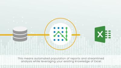
In 2023, data analysts have access to more data than at any other time in history. Experts believe the amount of data generated in 2023 totaled 120 zettabytes, and humans will create around 463 exabytes every day by 2025. That's an unimaginable volume of data! All this data, however, is worthless unless you can process it, analyze it, and find insights hidden within it. Data pipelines help you do that.

Set Analysis Redux: Do More with Qlik Episode 47

Set analysis in Qlik is a powerful data filtering and aggregation technique that allows users to create custom data subsets for analysis. It enables users to define complex criteria, known as set expressions, to isolate specific data points or dimensions within their Qlik applications. This feature is instrumental in performing advanced data manipulation, and it just got even easier with Qlik’s new AI enhancements.

Why is Product Analytics Important in the Automotive Industry

In an era defined by rapid technological advancements and increasing consumer expectations, the automotive industry faces unprecedented challenges and opportunities. Vehicle manufacturers must constantly innovate to remain competitive, and one indispensable tool in their arsenal is product analytics. This article explores compelling reasons why product analytics is essential for the automotive sector and suggests some additional considerations. So let's dive in!

How to exclude automation traffic from Google Analytics

When running automated tests frequently on your website, at one point it may be essential to keep your website statistics consistent with correct visitor counts, conversions, and geo-location data. The impact of such skewed data from automation can lead to pricy mistakes for incorrect ad targeting and the business economy statistics, hence it can be important to exclude test automation from analytics data.

Making Your Data Come to Life: 5 Best Practices and Tips for Data Visualization in 2024

Imagine looking at a bland spreadsheet filled with hundreds of columns containing nothing but some raw numbers… Be honest – how well would you understand the data presented in front of you? Even if you could, it’ll probably take some time until you connect the dots of how everything relates to one another. And on another note, not everyone in your business will be as data-savvy as you are. So, how can we fix this and make data understandable to all of the key members?