Systems | Development | Analytics | API | Testing
BI
Webinar Recording: Accelerating Cloud Data Modernization
Webinar Recording: Powering Modern Applications: Data Management for Speed and Scale
Partnering with AWS on Amazon HealthLake to Speed Insights
Gaps in patient healthcare, ranging from access and affordability, to those specific to race, gender, age and beyond, are widening across the US and leading to a variety of detrimental results for people, the healthcare system, and the economy itself. Such ongoing disparities are slowing the country’s ability to achieve population health and accounting for billions of dollars in unnecessary health care spending annually.
When Private Cloud is the Right Fit for Public Sector Missions
It’s no secret that IT modernization is a top priority for the US federal government. A quick trip in the congressional time machine to revisit 2017’s Modernizing Government Technology Act surfaces some of the most salient points regarding agencies’ challenges: In the private sector, excluding highly regulated industries like financial services, the migration to the public cloud was the answer to most IT modernization woes, especially those around data, analytics, and storage.
Leverage or liability - transforming data chaos into data excellence with Waterstone Mortgage
Snowflake's Retail Data Cloud
Transformational triumph: eBay's data fabric modernization
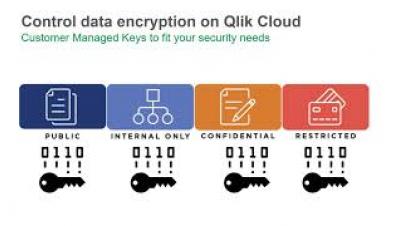
Protect Your Assets and Your Reputation in the Cloud
A recent headline in Wired magazine read “Uber Hack’s Devastation Is Just Starting to Reveal Itself.” There is no corporation that wants that headline and the reputational damage and financial loss it may cause. In the case of Uber it was a relatively simple attack using an approach called Multi Factor Authentication (MFA) fatigue. This is when an attacker takes advantage of authentication systems that require account owners to approve a log in.
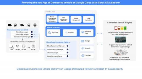
Unlocking the power of connected vehicle data and advanced analytics with BigQuery
Sibros’ Connected Vehicle Platform on Google Cloud delivers OTA data updates, collection, and commands with the flexibility and scale of the cloud


