Systems | Development | Analytics | API | Testing

On Demand Tabular Reports - SaaS in 60

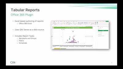
Last year we released Tabular Reporting, a new Excel and Office 365 add-in that addresses operational report and distribution requirements by creating formatted reports using existing Qlik Cloud Analytics apps and data. Now you can make those same reports available to download, on demand, directly to users while they analyze data within a Qlik Cloud Analytics app, complete with their preferred data selections.

Qlik Cloud Analytics - Art of the Possible, Embedding Qlik, Capabilities Recap and Getting Started

Join Principal Technical Marketing Manager Mike Tarallo and Senior Web Developer Ouadie Limouni as the team up once again to show you what is possible and what you may have missed in the Qlik Cloud platform. Witness the art of the possible, sophisticated and simple embedding, and a recent recap of the capabilities that make Qlik a leader for 14 years in the Gartner Magic Quadrant in Analytics and Business Intelligence Platforms.

SaaS in 60 - Cyclic Group Dimensions

This week a new Dimension type for Master Item Dimensions is available, Cyclic groups. You all know that Master Items offer a centralized, reusable governed library of measures, expressions, visualizations and both single and drillable dimensions – now with Cyclic group defined dimensions – you can dynamically cycle through dimensions in every chart, at the same time using a click of a button or simple selection. Offering new ways to analyze data, save precious screen space and enable multiple use cases on a single chart.

How to Create a Collapsible Filter Panel - Do More with Qlik

In my last blog / video. I showed you how to easily create visual buttons to apply selections and change their visual selection state so they can appear enabled or disabled (selected, not-selected). In this video I'll show you how to setup a filter panel using buttons and the layout container to create a simple collapsible filter panel that is both esthetic and functional while also providing real estate for your dashboard objects.

How to Create Visual Button Selection States - Do More with Qlik

Ever wonder how those Qlik experts make those awesome interactive dashboards? It is easier than you think. Check out this video that quickly shows you how to create custom beautiful buttons to apply selections and visually represent an active or non-active selection state. Allowing users just another way to analyze data in a way that is easy and familiar.

Tabular Reporting for NPrinting Users - Do More with Qlik

Join Michael Tarallo, along with special guests Product Manager Andrew Kruger and Principal Platform Architect Johnny Poole, for part 2 of Qlik Tabular Reporting. In this session, the focus shifts to the migration path for NPrinting users, exploring available utilities, migration paths and best practices for a seamless transition.