
Systems | Development | Analytics | API | Testing

Everything you need to know about the new user experience across Qlik Cloud Analytics and Qlik Talend Cloud

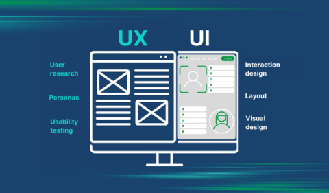
Do attractive things work better? Some say they do, and for good reason. According to a widely cited Stanford research study, 94% of first impressions are design related. Visually appealing designs have the remarkable ability to influence user perception and make it easier for people to find solutions to the problems they encounter. This is a testament to the power of design in shaping the user experience.
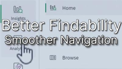
SaaS in 60 - Qlik Talend Data Integration Navigation Improvements

This week, we’re excited to introduce changes that enhance your experience with Qlik Cloud’s Talend Data Integration. Key updates include new Activity Centers and improvements to the data integration homepage. Access Activity Centers via the new waffle menu in the upper left for easier navigation providing a consistent anchor throughout the platform. And coming Soon, a new landing page will combine the Getting Started and Home pages into a single starting point, with key actions highlighted at the top.

Save Time and Improve the Accuracy of Your NetSuite Reporting

Financial and operational reporting for NetSuite can be a challenge. As is the case with many ERP systems, NetSuite’s reporting capabilities tend to be somewhat restrictive. It can be difficult to pull information from multiple NetSuite modules into a single, cohesive report. In other instances, information for which there ought to be a fairly straightforward reporting process turns out to be inaccessible.

Choosing the Right Chart Type for Good Data Visualization

An effective dashboard requires careful design to present data in the best way, and to help more people (users, customers) find insights without feeling overwhelmed. Yellowfin BI comes with a wide variety of chart types as part of its extensive data visualization tools, and while it is tempting to use a lot of eye-catching charts to make a dashboard that looks great, it is important to select the right chart for the right situation.

RAG vs Fine-Tuning: Navigating the Path to Enhanced LLMs

RAG and Fine-Tuning are two prominent LLM customization approaches. While RAG involves providing external and dynamic resources to trained models, fine-tuning involves further training on specialized datasets, altering the model. Each approach can be used for different use cases. In this blog post, we explain each approach, compare the two and recommend when to use them and which pitfalls to avoid.

Why It's Time to Update Your Embedded Analytics

After 20 years of dashboards, today’s line-of-business users expect more value from their analytics, and it’s up to your business to keep updated - or risk getting left behind. There was a time when product teams could purchase basic dashboards and data visualizations, and that was more than enough to satisfy the average user’s business intelligence (BI) and analytics needs. Today, however? Not so much.

Mastering Data Compliance: Tips, Strategies, and Best Practices

Data has become the lifeblood of businesses across all industries. With the exponential growth of data collection and processing, the importance of data compliance has skyrocketed. And navigating this complex business landscape is vital for any organization handling sensitive information. 5 key takeaways from this post on mastering data compliance are.