Systems | Development | Analytics | API | Testing
Analytics
Future of Data Meetup: Apache Ozone User Group Summit
My Friend Biaggio and the Data Warehouse: A Cautionary Tale
Maps, Violin Plots and Waterfalls
A good data visual can provide a very fast construct of a situation or trend – useful when you have a large, complex dataset or information that isn’t joined or connected. There are many types of data visualizations available. Which is the right one for your use case?
Google Analytics 4 Custom Dimensions 101 Guide
7 Reasons Why We Integrated dbt into Keboola
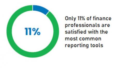
Achieve Insightful Operational Reporting for Oracle ERPs
Your business needs actionable insights from your Oracle ERP data to respond to volatile market conditions and outpace your competition. But generating custom reports requires deep technical knowledge and the process is often managed by IT. The process can often take weeks, if not months, and, in many cases, the report or dashboard is limited to a single use case and applicable only to a single business unit or user – often only the requester.
Episode 6 | Data Analytics | 7 Challenges of Big Data Analytics
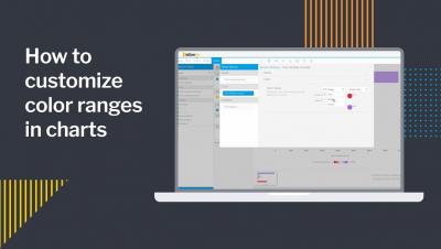
How to customize color ranges in charts
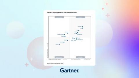
Our reflections on the 2022 Gartner Magic Quadrant for Data Quality Solutions
In its 2022 Magic Quadrant™ for Data Quality Solutions report, Gartner® emphasizes the “importance of having a critical approach toward managing the health and fitness of data.” We agree that “poor data quality completely destroys business value.” Organizations simply cannot afford for data quality to be an afterthought. And if you’re currently in the process of evaluating data solutions for your organization, this report can help.


