Systems | Development | Analytics | API | Testing
Analytics
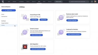
Activate your dbt models and metrics with ThoughtSpot
The Denver Broncos score a better fan experience with Fivetran
Four ways to write faster data models with Wizard for dbt Core
Transforming your data is an essential part of ELT. Learn how Fivetran’s Wizard for dbt Core™ and BigQuery can help.
Hevo vs Fivetran vs Integrate.io: An ETL Tool Comparison
[DEMO] Building Customer 360 views with healthy data
Optimize your data modeling with Wizard for dbt Core
6 most useful data visualization principles for analysts
The difference between consuming data and actioning it often comes down to one thing: effective data visualization. Case in point? The John Snow’s famous cholera map. In 1854, John Snow (no, not that one) mapped cholera cases during an outbreak in London. Snow’s simple map uncovered a brand new pattern in the data—the cases all clustered around a shared water pump.
Data Lakes: The Achilles Heel of the Big Data Movement
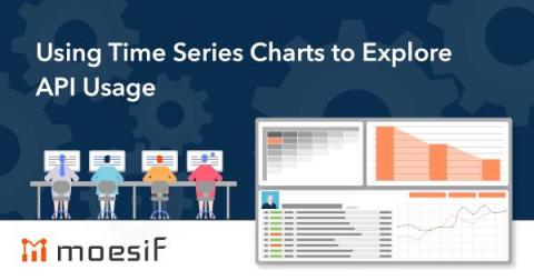
Using Time Series Charts to Explore API Usage
One major reason for digging into API and product analytics is to be able to easily identify trends in the data. Of course, trends can be very tough to see when looking at something like raw API call logs but can be much easier when looking at a chart aimed at easily allowing you to visualize trends. Enter the Time Series chart.


