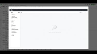


Businesses have been scaling rapidly in the cloud, driven by the pandemic and lured by the promise of agility and flexibility. But here’s a dirty little secret anyone who works in data knows. Despite the value of the cloud, tons of data hasn’t made it there. So, where is it? Spreadsheets. Still the stalwart workhorse, hero, and bane of the business world. We all love how Google revolutionized this world by bringing spreadsheets to the cloud.
SQL is the universal language of data modeling. While it is not what everyone uses, it is what most analytics engineers use. SQL is found all across the most popular modern data stack tools; ThoughtSpot’s SearchIQ query engine translates natural language query into complex SQL commands on the fly, dbt built the entire premise of their tool around SQL and Jinja. And within your Snowflake data platform, it’s used to query all your tables.
I’ve been following the Streamlit framework for a while, since Snowflake announced that they would acquire it to enable data engineers to quick spin up data apps. I decided to play around with it and see how we could leverage the speed of creating an app along with the benefits that ThoughtSpot provides, especially around the ability to use NLP for search terms. Streamlit is built in Python.
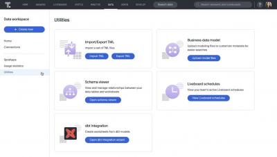
If you haven’t heard of dbt, you’re missing out on one of the hottest technologies in data. dbt has been adopted by more than 15,000 organizations looking for a SQL-friendly workflow to transform the data inside their cloud data platform.
The difference between consuming data and actioning it often comes down to one thing: effective data visualization. Case in point? The John Snow’s famous cholera map. In 1854, John Snow (no, not that one) mapped cholera cases during an outbreak in London. Snow’s simple map uncovered a brand new pattern in the data—the cases all clustered around a shared water pump.