Systems | Development | Analytics | API | Testing

December 2023

SaaS in 60 - New Pivot Table

Unlock the power of data with our new, redesigned Pivot Table available in the Visualization Bundle. The New Pivot Table can quickly transform rows and columns into actionable insights with just a few clicks. You can organize, analyze, and visualize your data and even style various elements such as headers, borders, fonts, grid lines and more. Say goodbye to manual calculations and hello to dynamic summaries. Pivot Tables,. simplify complexity, reveal patterns, and take control of your information. Try it now and elevate your data game to new heights.

Unlock the Power of Data with AI, Machine Learning & Automation - Do More With Qlik - Episode 48

Explore the transformative potential of Qlik Cloud, featuring advanced AI capabilities, seamless automation integration, and robust Machine Learning for enhanced predictability. Join Rocco Pecroa and Mike Tarallo from Qlik as they uncover how Qlik Cloud can revolutionize the data analysis process, providing a new way for analysts to engage with their data.

SaaS in 60 - Tabular Reporting

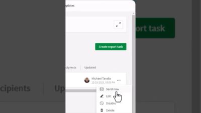
This week Qlik Cloud customers can now address common operational report and distribution requirements with our new Tabular Reporting capabilities. Report developers can use an O365 Excel add-in to create custom, formatted, Excel documents from Qlik data and Qlik visualizations. Governed Report Tasks can burst these reports, delivering recipient specific data to any stakeholder, with the Qlik platform as the source for business decisions.

My Top 5 Data Moments for 2023

Data has had quite the year, hasn’t it? I have worked in the data and analytics space more years than I would like to admit, but I can honestly say that it’s been one of the most exciting, wild rides in recent memory. Qlik has been along for that ride, and brought quite a bit of excitement all on its own. So I thought I would recap the five moments that really stand out for me from the world of data… and Qlik in 2023. But, hang on.

SaaS in 60 - A Gift For You - New Layout Container

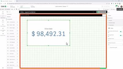
The Layout Container gives you new ways to create content and design dashboards in Qlik Analytics, our new layout container object. The layout container, part of the Qlik Analytics dashboard bundle, is a new object that enables free layout of charts, the ability to stack visualizations, combine charts into new visualizations, as well as multi-select and group objects for easier sizing, positioning and alignment.

Introducing the New Layout Container - Tips, Tricks and Nuances

The layout container is useful when you want to build a custom display containing multiple charts as a single unit. Unlike the container, which uses tabs to cycle through charts, the layout container is a space where you are free to customize your own layout of the charts in the layout container. As the layout container offers sheet-like arrangement of visualizations, you can functionally store multiple sheets within a sheet that can be expanded for more detail.