Systems | Development | Analytics | API | Testing
Dashboards
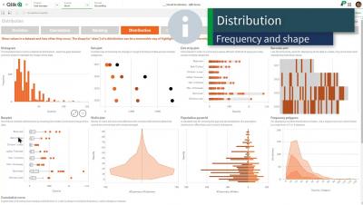
Qlik Sense Visualization Showcase
A Sneak Peek at Scaling Without (So Much) Pain [Destination: Scale]
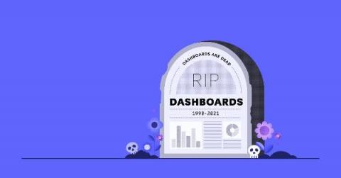
The day the dashboard died
For more than 20 years, dashboards served as a foundational element of business intelligence, helping leaders visualize and share valuable data across their organization. At inception, dashboards were the perfect vehicle for delivering key report KPIs without data workers needing a background in coding or IT. But much has changed over the last two decades, including the appetite and needs of your business users.
How to Implement Prometheus Monitoring + Grafana Dashboards
Enterprises looking to decrease downtime and optimize resources can implement server monitoring using tools like Prometheus and Grafana.
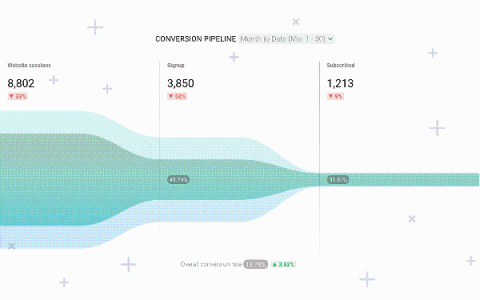
Chart Visualizations: 6 (more) Updates Now Live
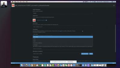
Exploring Data & Dashboard Creation on CDP Public Cloud
Analytics best practice: 5 key dashboard design principles
Simply put, a lot of effort is going into creating dashboards that the intended audience don’t even look at. The main purpose of a dashboard is to communicate business data in a visual form that highlights to the reader what is important, arranges it for clarity and leads them through a sequence that tells the story best so they can make better data-led decisions. Design and an understanding of how humans make decisions exist to assist this purpose.
The Dashboard Is Dead, Long Live the Dashboard
There is a lot of talk these days about the dashboard being a thing of the past. After all, simply displaying KPIs and visualizations in a dashboard is something everyone can do, right? If monitoring KPIs is all you need to do, then we would agree: The dashboard is largely dead. We can deliver those singular data points to you anywhere, monitoring what you’re interested in, alerting you to changes and triggering action.
The death of the dashboard: What it really means for analytics
Let’s get this out of the way: To understand the much discussed ’death of the dashboard' proclamation, the phrase needs to be viewed under a different lens beyond the literal. Firstly, it's not a new concept at all: Yellowfin have been saying it for years. The problem is in the current confusing interpretation around what it means for business intelligence. In short, dashboards aren’t actually dying, nor is their usefulness for certain users spent.


