Systems | Development | Analytics | API | Testing
Dashboards
Analytics best practice: 5 key dashboard design principles
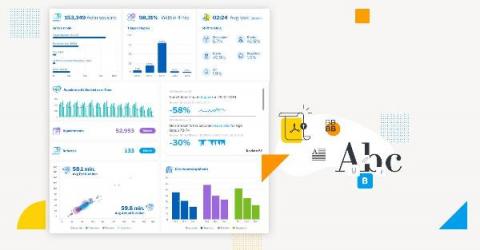
Simply put, a lot of effort is going into creating dashboards that the intended audience don’t even look at. The main purpose of a dashboard is to communicate business data in a visual form that highlights to the reader what is important, arranges it for clarity and leads them through a sequence that tells the story best so they can make better data-led decisions. Design and an understanding of how humans make decisions exist to assist this purpose.
The death of the dashboard: What it really means for analytics
Let’s get this out of the way: To understand the much discussed ’death of the dashboard' proclamation, the phrase needs to be viewed under a different lens beyond the literal. Firstly, it's not a new concept at all: Yellowfin have been saying it for years. The problem is in the current confusing interpretation around what it means for business intelligence. In short, dashboards aren’t actually dying, nor is their usefulness for certain users spent.
The Dashboard Is Dead, Long Live the Dashboard
There is a lot of talk these days about the dashboard being a thing of the past. After all, simply displaying KPIs and visualizations in a dashboard is something everyone can do, right? If monitoring KPIs is all you need to do, then we would agree: The dashboard is largely dead. We can deliver those singular data points to you anywhere, monitoring what you’re interested in, alerting you to changes and triggering action.
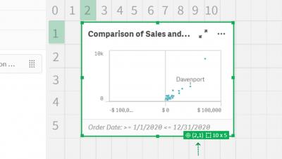
Qlik Sense SaaS in 60 - Active Grid and Chart Dimensions
Transform Your TV Into a Powerful SaaS KPI Dashboard in 4 Simple Steps
With 42 percent of Americans still working from home, we're using TVs for more than just Netflix. These viewing screens double up as dynamic digital dashboards, displaying powerful SaaS metrics that power your business. Whether you're working from home or the office, turning your TV into a SaaS KPI dashboard is simple. Five tools are all you need. This guide shows you how to bring business metrics to the small screen with your very own custom SaaS KPI dashboard.
Using Chartio with Xplenty Part 2: Visualizing the Data
In Part 1 we learned how to set up our Xplenty pipeline to work with Chartio and prepared the data source. In Part 2, we will focus on using the data Xplenty provides in the Chartio platform. If you're new to Chartio, you can read through their QuickStart docs (shouldn't take more than 5-10 minutes) to gain some familiarity.
No Lag Dashboards With Xplenty
Are you tired of slow dashboards? It’s a problem we hear end-users of BI tools complain about time and time again. Whether you’re an end-user or on the data team that the end-users blame, slow dashboards suck! With many BI tools now offering their own connectors and lightweight data transformation/preparation layers, slow dashboards are a common pain point across all organizations.
7 Metrics to Include in Your Management Dashboard
Using Chartio with Xplenty Part 1: Setting Up Your Pipelines
Xplenty provides features to efficiently extract, transform, and store data from various sources. Chartio provides Visual SQL features that let us explore and analyze data. Furthermore, it includes functionality to arrange charts and metrics in dashboards that can be shared. Both these tools can be used synergically. In this post, we will cover how you to configured Xplenty to use Chartio data. In a subsequent post, we will explain how to visualize the data provided by Xplenty in Chartio.


