Systems | Development | Analytics | API | Testing

Dashboards

If Dashboards Are Dead, Why Are We Embedding Them?

For decades, the analytics/BI community has suffered from low user adoption (~30%). Dashboards and fancy visualizations have only proven to be the starting point of the analytics journey, not the endpoint. We are living in a world that demands far greater agility than a fixed layer of information or KPI can provide. Poor user adoption is the result when the analytics system fails to support the users full journey: from data – to insight – to action.

Yellowfin: the embedded BI platform of choice for dashboard designers

For our Head of Product Design and Creative Director, Tony Prysten, design is always top of mind. In analytics platforms, good design plays an important role in how people understand and use data. Here Tony shares how Yellowfin has been created with designers and developers in mind.

Dashboards vs automated business monitoring: What's the difference?

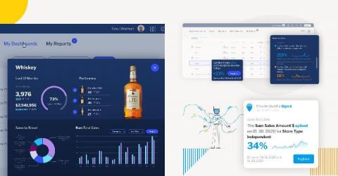
In 2020, however, contining to rely just on dashboards for your BI needs isn't enough. Why? Data is growing exponentially - in both size and complexity - within every business today. Manually keeping track of performance and searching for insights has become difficult for many users, and it's fostered new expectations - to be able to do more with analytics - including making it faster and easier to keep on top of changes or opportunities.

Mini Charts - Another Way To Visualize Your Data

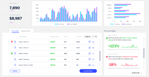
Have you ever felt that, by looking at just numbers, that you are probably missing out on the bigger picture? That’s, of course, why we have visualizations – to form patterns out of those numbers that we can then interpret, as well as glean insights from and deepen our understanding of what the data reveals. Now, what if we bring numbers and visualizations together in a table, one way to explore those numbers and find hidden gems of meaning? Let’s have a look at mini charts!

How To Pick The Right Type of Log Data Visualisation

Data visualisations allow users to organise and present log data in a practical, usable, and sensible manner. This tool in log management ensures that the data collected communicates real-time, actionable insights that will support timely and informed decision-making. Knowing which types of visualisation best suits a particular data set is critical in giving data visualisation optimal business value. Here is how to pick the right type of log data visualisation. Pie charts

How design flexibility gives you a better dashboard experience

Our Head of Product Design and Creative Director, Tony Prysten, has worked in brand, design and advertising roles over the course of his career. Bringing his wealth of experience to Yellowfin, he now shapes the creative and UX experience of our product. Here he shares his thoughts on how design flexibility improves the dashboard experience.